The Rolling Stones are one of the most influential bands of all time. The group has origins built around the lifelong friendship of frontman Mick Jagger and guitarist Keith Richards, artists who met during school in Dartford, Kent. Little did the pair know at the time of meeting that in just over a decade, they, alongside their future bandmates, would have risen to become some of the most iconic rock ‘n’ rollers of all time, eclipsing their heroes such as Bo Diddley and Little Richard, carving their names into popular culture ad infinitum.
Rock music’s resident hellraising rabble, The Rolling Stones are a fascinating act in that they are equally as known for their raucous off-stage antics as their music. Running alongside their delivery of many timeless cuts ranging from ‘Gimme Shelter’ to ‘Ruby Tuesday’ is that the band are, arguably, the one outfit that embodies rock and roll excess the greatest. Always spearheaded by their songwriting team, Jagger and Richards, The Rolling Stones’ musical and extra-musical career would not be the same without these two Kentish buccaneers.
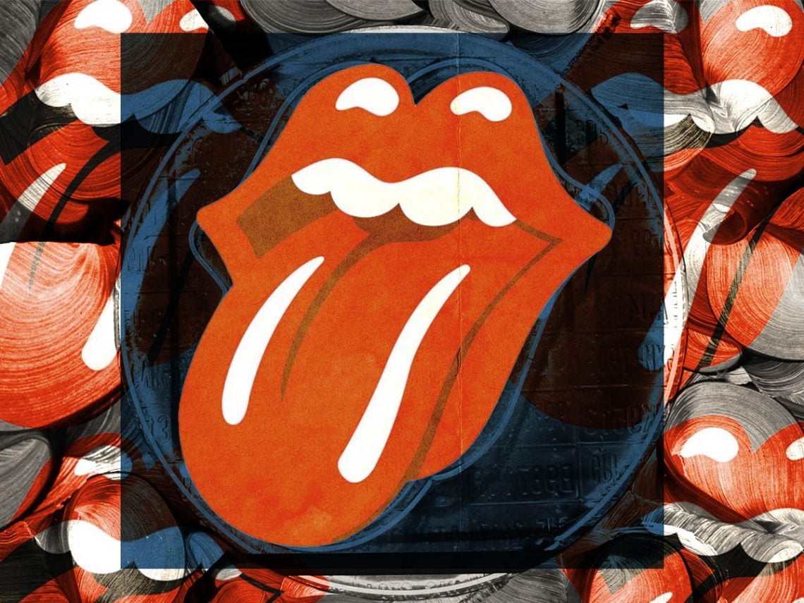
Given that the band remains so iconic, it is only fitting that they have an equally as legendary logo. Interestingly, The Stones sailed throughout the 1960s without a logo, but when they entered the equally as fruitful 1970s, they knew they needed a symbol for their swaggering brand of rock ‘n’ roll. In 1970, they were unhappy with the designs that their record label Decca Records had offered them for their European tour poster, so they decided to take matters into their own hands.
Originally named ‘Tongue and Lips’, the end result is the most famous band logo on the planet, featuring on all of their post-1970 records and singles and on their merchandise and sets. It was designed by the now-esteemed English artist John Pasche, who was then a third-year art student, whose work caught Mick Jagger’s eye at a show.
For the logo, Jagger suggested the tongue of the Hindu goddess Kali as inspiration. Of the inception of the design, Pasche recalled: “The design concept for the tongue was to represent the band’s anti-authoritarian attitude, Mick’s mouth, and the obvious sexual connotations. I designed it in such a way that it was easily reproduced and in a style I thought could stand the test of time.”
Later, when speaking to The New York Times in 2015, Pasche said: “I didn’t want to do anything Indian, because I thought it would be very dated quickly, as everyone was going through that phase at the time”.
Despite this, Pasche did admit that he took some inspiration from this “phase” and created a timeless piece of art that is more ubiquitous than the band’s music, a testament to his skill and bravery to look past the zeitgeist of the time.


