Born of spontaneity, uncertainty, and the pressures of life, Dark Side of the Moon, Pink Floyd’s eighth studio album, was released in 1973 by Harvest Records. The songs from the album were mostly written while the band was on tour; improvised instrumental stories that would later find its footing with a maturing lyricist within Roger Waters, who David Gilmour, in the 2003 documentary of the same name as the album, stated: “The big move forward on Dark Side of the Moon, was Roger’s coming of age, lyrically, and having the ideas and intelligence to take a subject and examine it in all its parts, in all those different songs.”
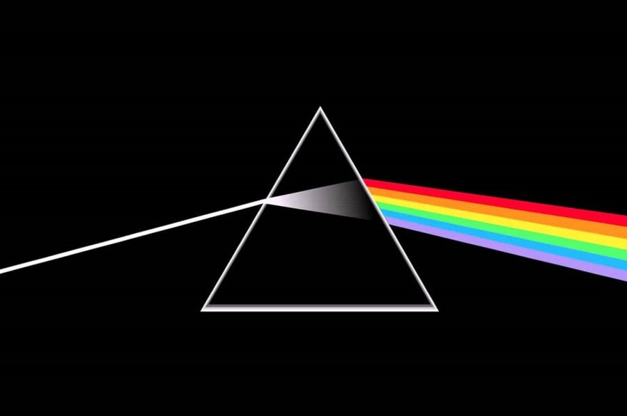
When Pink Floyd’s keyboard player Richard Wright asked the graphic designer, Storm Thorgerson, to create the album’s artwork, Wright requested something “simple and elegant”. Thorgerson and along with his team of artists of Hipgnosis, a London-based art-design group, returned with what still remains, one of the most iconic and memorable designs for an album.
The prism dispersing light which Thorgerson, had seen in a physics textbook, according to The Sound publication; was thus created out of true creative freedom and trust, as the two — Floyd and Hipgnosis — had worked together in the past on an earlier album of the former, namely, Saucerful of Secrets. Specifically, George Hardie, an artist for the design group, Hipgnosis, drew the illustration.
The design has become the signature logo of Pink Floyd, as it subtly alludes to Floyd’s spectacular live light show, which they were very well known for. Pink Floyd almost immediately approved the artwork; Roger Waters would then suggest the light of the prism be extended through to the other side of the physical album cover, connecting the two with a heart-blip, as would be seen on a heart monitor. One can then trace the elongated beam, and follow the multi-spectral light across when opening the album.
While Dark Side of the Moon is, in fact, a concept album. It is still a loosely connected one, reflecting how fragile, life can be at times. Through themes of the basic pressures of life in money, mental illness, coming of age, and weariness from travel, it is in ways, a very personal album, specifically to Waters. However, these themes that happen to be personal to Waters, are also very universal in its essence; Roger Waters has always written from a very humanistic point of voice.
While it is an album born from distress and fear, it is also a celebration of life, as symbolised by the iconic spectral light. Triangles and pyramids are objects of mythologised geometry; they are sacred shapes, somehow randomly appearing in the systemised chaos of the very fabric of life. The album is a monumental achievement – it is the complete opposite of pretension and superficiality; it simply exists as a force of nature that was created out of necessity.
As Roger Waters once said while looking back at that period of time, “we could have all gone off. I’m glad we didn’t, out of all the enmities, and anxieties that were left behind, you know, in the rubble of the expulsion of that enormous success—came all kinds of wounded creatures—that had their own story to tell.”